 bermansplaining
The Lab · /lab/the-arches-were-ai
The Arches Were AI
I printed a little marble library that counts the books I’ve read. The books came out sharp. The arches came out looking chewed. Same printer, same spool, same plate. What changed from part to part was where each surface came from.
This was a test run. I want to sell small printed desk objects on Etsy, and before I build a catalog I wanted to walk one product the whole way through: an idea, an AI concept, an AI-generated 3D model, a cleanup pass with Claude, a real print, and then an agent going over the result to tell me what to fix. The Book Counter was the guinea pig.
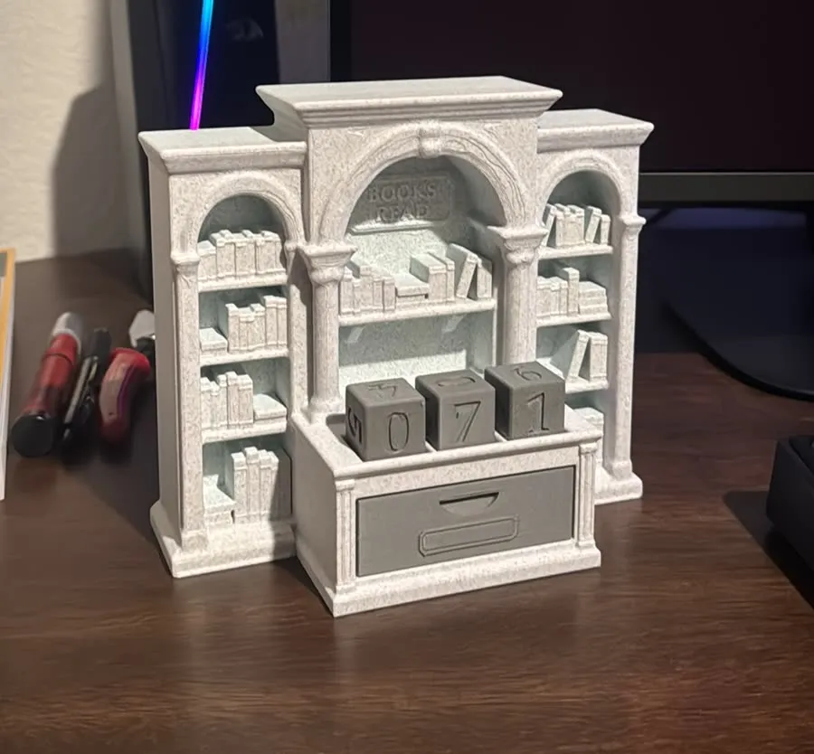
173 × 152 × 82 mm · six 20 mm cubes · counts 000–999 · Bambu P1S · 0.20 mm layers
The run
- Idea. A desk object for a reading habit that’s nice enough to leave out.
- Concept. A text-to-image model drew the look.
- 3D. An image-to-3D model turned that render into a mesh.
- Cleanup. Claude and I rebuilt everything that had to work in code.
- Print. Prototype 1 on my Bambu P1S.
- Review. An agent took the photos and the STL and worked out what went wrong.
- Hand-off. What it found became rules and skills for the agents, so the next product starts where this one ended.
What it is
The Book Counter is a desk object for a reading habit. Three cubes sit on the counter and show the count. Three more wait in the drawer. There are two kinds of cube: A carries 0 to 5, B carries 0, 1 and 6 to 9. With one cube per digit you can show every number from 000 to 999, and nobody has to pretend a 6 is a 9. When the count rolls over, you open the drawer, swap a cube, and the spare goes back in its well.
The look started as a text-to-image concept: a small Victorian reading room with a tall center arch and two arched bookcase wings. An image-to-3D model turned that render into a mesh. Then Claude and I rebuilt everything that had to work in code. That covered the counter, the drawer and its wells, the cube pockets, the cubes, the BOOKS READ plaque, and every book on every shelf. The arches, columns and cornices stayed as the generator made them, smoothed with a blur.
What came out right
Most of it. The drawer fits with no sanding. The cubes sit in their pockets with a millimeter of play on each side. The plaque letters are crisp at 5 mm tall. The books were the surprise: 72 tiny volumes, some leaning, some stacked, each with spine bands, and they read as books from across the room.
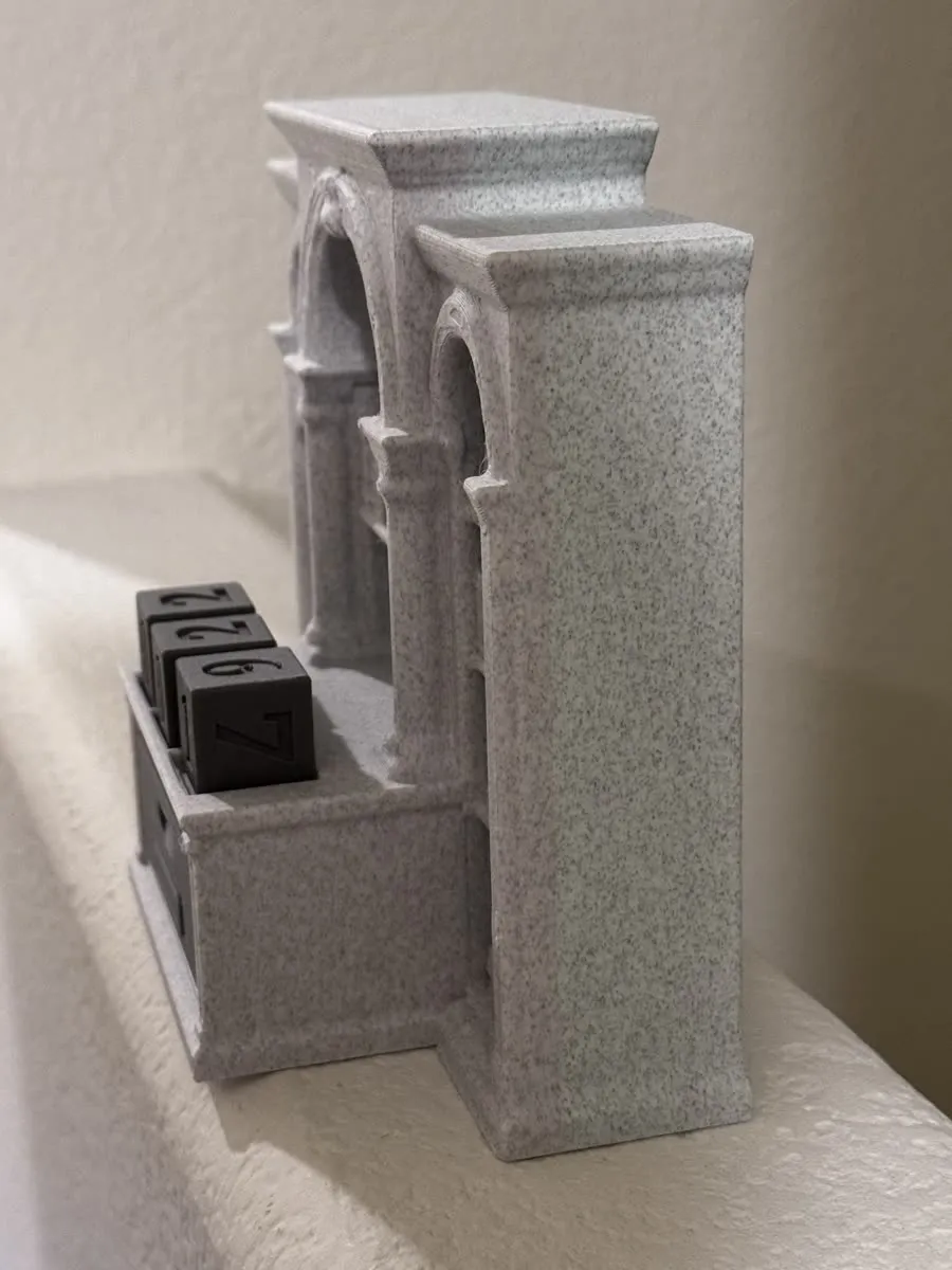
The marble filament earns its keep on the big flat faces. The speckle swallows the layer lines, and the sides read as stone.
What didn’t
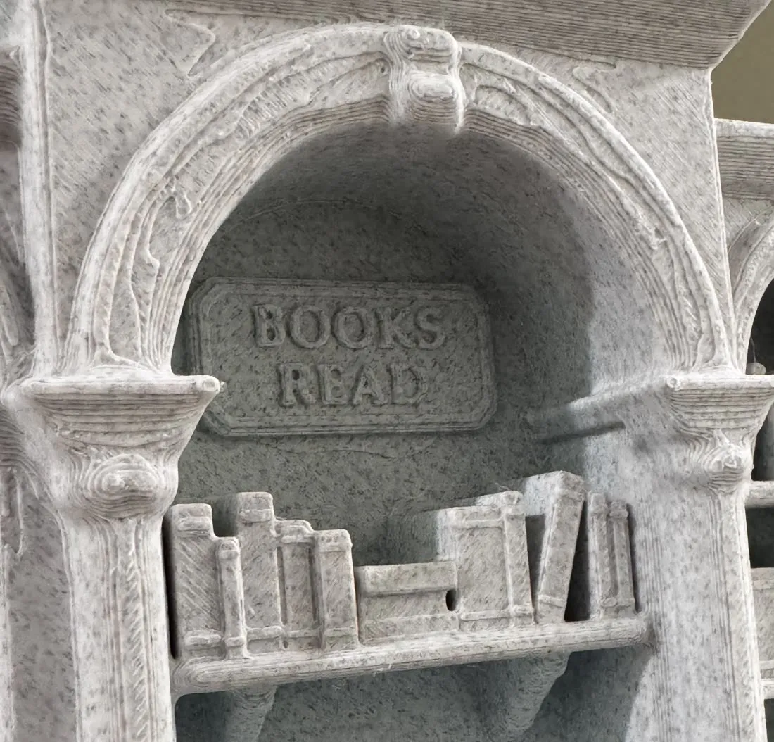
The arches. They’re the first thing you look at, and up close they look frayed. There’s grain that wanders, small hatched patches, and a few hair-thin strings.

Why the arches frayed
This is the part I handed to an agent: photos of the print, the STL, and the question “why?” Here’s what it came back with.
The body prints lying on its back with the front facing up. For this shape that’s the right call: deep shelves, no supports, nothing to clean up afterwards. It also means every bit of front relief is built as a stack of 0.2 mm layers, and anything gently sloped turns into a contour map.
A real arch molding is a sweep. Its height stays the same all the way around the curve, so its layer lines run along it as clean concentric arcs. The generated molding is a low, lumpy dome. Along one arc of the center arch its height wanders by 0.38 mm, which is almost exactly two layers. So the layer edges cut across the molding, 22 times on that one arc. Each crossing leaves a tiny island that the slicer has to outline, fill with diagonal top lines, and travel away from. That’s where the grain, the hatching and the strings come from.
You can see it before printing. The second image above comes from the STL alone: a height map of the front, with a red line wherever a layer edge lands on a shallow slope. The loops beside the keystone and the rings on the capitals match the print almost line for line.
The books dodged all of this because they’re simple blocks with flat fronts and straight sides. Face up, that’s a clean top surface and clean walls. Even the leaning ones lean sideways, flat along the bed. The blur I used to tidy the generated mesh made the arches worse. Blur turns sharp noise into soft, shallow domes, and a shallow dome is the shape that steps worst.
| Part | Geometry came from | Printed |
|---|---|---|
| Counter, drawer, cube pockets | Code | Crisp |
| Number cubes | Code | Crisp |
| BOOKS READ plaque | Code, Palatino Bold | Crisp |
| 72 books | Code, seeded generator | Crisp |
| Arches, capitals, cornices, shelf brackets | Image-to-3D mesh, blurred | Frayed |
What the agents took away
The generated model is a reference. It’s great at silhouette and proportion, and it gave this thing its personality. It’s bad at surfaces a printer has to trace. So every 3D project in my workspace, and every agent that works in it, now follows one rule: measure the AI model, then rebuild anything hard-surface in code. Only organic shapes like animals and faces keep the generated mesh.
For anything printed face up, the rebuilt relief follows three rules:
- Every top-facing surface is flat, a 45° chamfer, or a clean sweep whose layer lines run along it.
- Relief steps are whole layers, in multiples of 0.4 mm.
- Openings are cut after the ornament, so nothing sticks out over air.
The red-line map is now a script, terrace_check.py, and it runs on every STL with front relief before anything goes to the slicer.
None of that lives in my head or in one chat. The rules, the check script, and the slicer lessons further down went into the skills my agents load for 3D work. The next product doesn’t start from zero. It starts with an agent that already knows the arches were AI.
Prototype 2
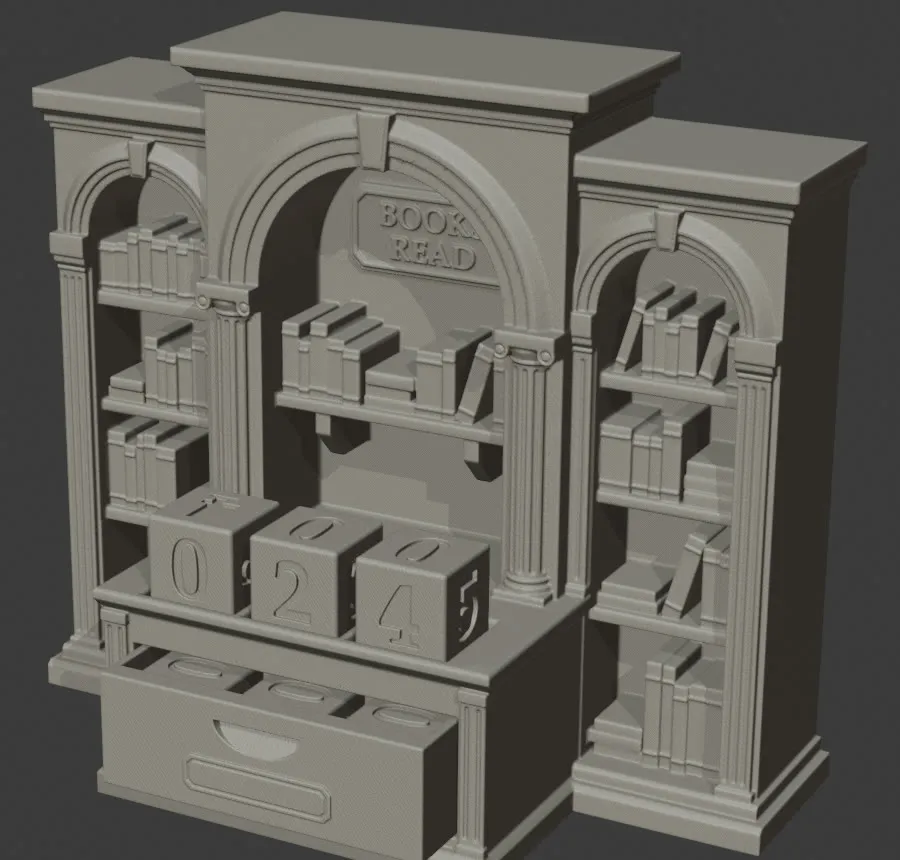
Claude rebuilt the whole body in code from measurements of prototype 1. The archivolts are three stepped bands standing 0.8, 1.6 and 2.4 mm proud, with a 45° outer edge. That’s also what the original concept render showed before the mesh step melted it. The keystones are stepped wedges. The columns are fluted, with simple Ionic capitals whose volutes are flat discs, like coins. The wing pilasters borrow the fluted counter pilasters, which printed perfectly the first time. Every position the books, drawer and cubes depend on stayed put.

| Measured on the STL | Prototype 1 | Prototype 2 |
|---|---|---|
| Center archivolt height wobble along one arc | 0.38 mm | 0.00 mm |
| Layer edges crossing that arc | 22 | 0 |
| Wing archivolt wobble | 0.53 mm | 0.01 mm |
| Body, sliced for the P1S | 6 h 00 m · 280 g | 5 h 13 m · 163 g |
| Arch test coupon | skipped | 28 m · 14 g |
Most of that saving is slicer settings. I printed prototype 1 with 15% grid infill. With lightning infill the same old body slices at 4 h 32 m and 158 g. Prototype 2 uses lightning, plus slower outer walls for cleaner edges, which add back about 40 minutes.
Other things the first print taught me
- Infill. Inside a solid display piece, lightning does the same job as 15% grid for an hour and a half and 120 g less.
- The coupon I skipped. My own design notes asked for an arch test print before the full body. I only printed the drawer-fit coupon. A 28-minute arch coupon would have shown all of this before a 6-hour body.
- Numerals. Gray numbers recessed into gray cubes read by shadow alone. Cream inlay files for the numerals already exist, and the next print uses them.
Next
Print the arch coupon. If the bands come out as clean arcs, print the body. After that comes personalization, which is what turns a prototype into an Etsy listing. The drawer front becomes a card-catalog label holder that takes a small ex libris card. Paper can carry engraving-style art that no FDM printer can, and the body and drawer stay stock parts.
Then the next item goes through the same run, with agents that already know the rules.
How this was made: prototype 1 photos are from my phone; prototype 2 is a render and slicer numbers. The concept and the first mesh came from generative models. Claude did the code rebuild, the analysis, and the first draft of this post as an artifact. Reviewed and edited by me.